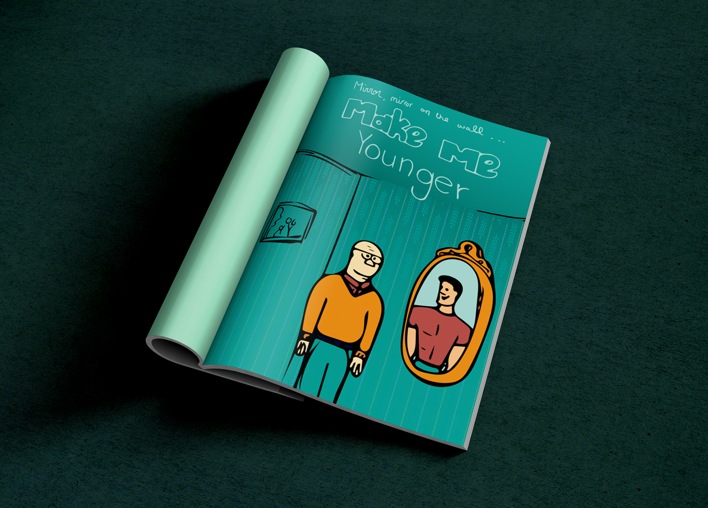
A Harvard professor says he can cure aging, but is that a good idea?
Creating an editorial illustration is something I’ve never done before. At first I had no idea how I would accomplish this task since I wanted my illustration to have a cartoon, hand-drawn look. I also how no idea what I wanted to draw, so I first read the article that I would be creating an illustration for: “A Harvard professor says he can cure aging, but is that a good idea?”
I had to read the article several times in order to understand the concept I would be working with. Then I created words lists – lists of words that popped into my mind that were associated with the message of the article.
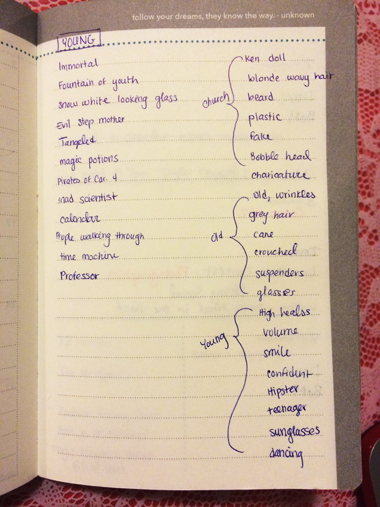
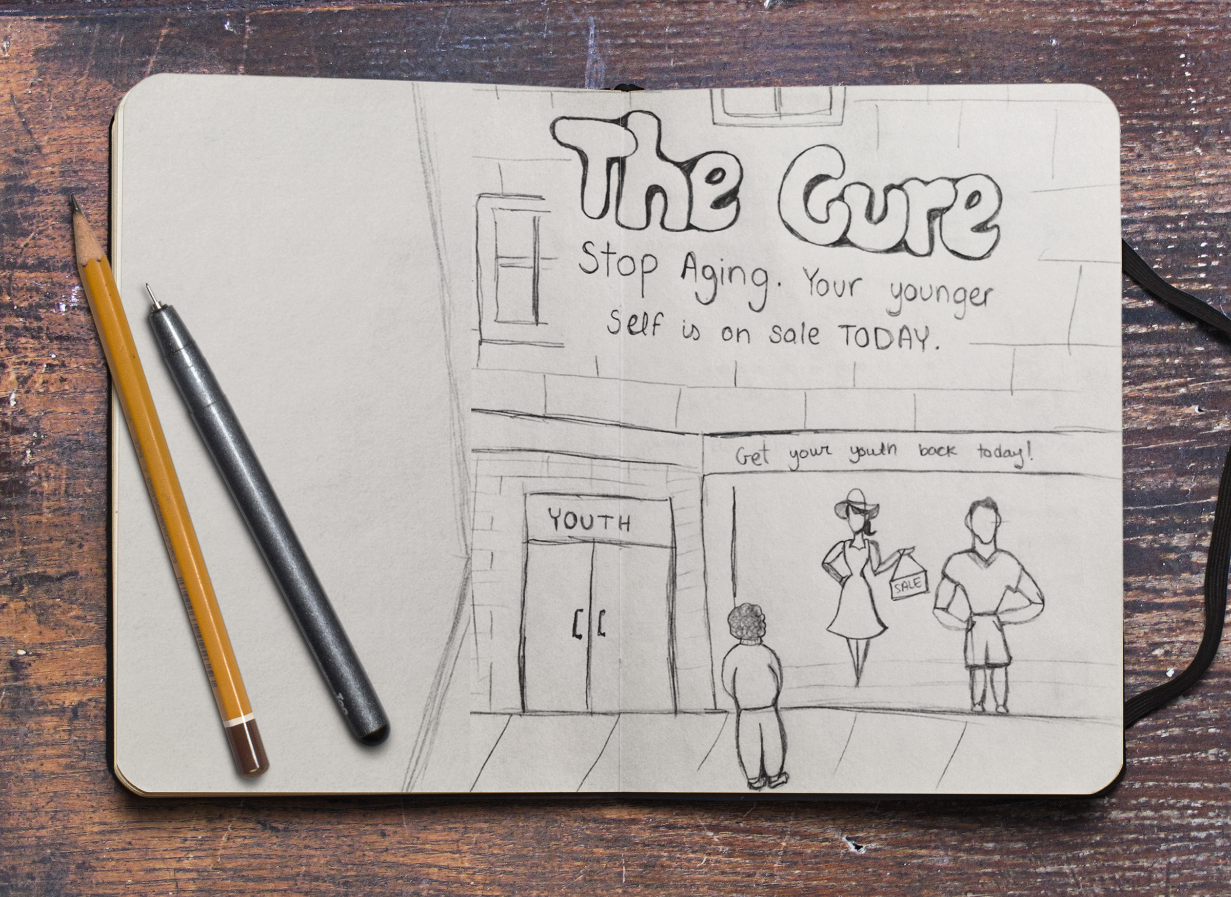
The word lists got me started visualizing in my mind different illustration ideas and I went on to sketch out three of my favorites.
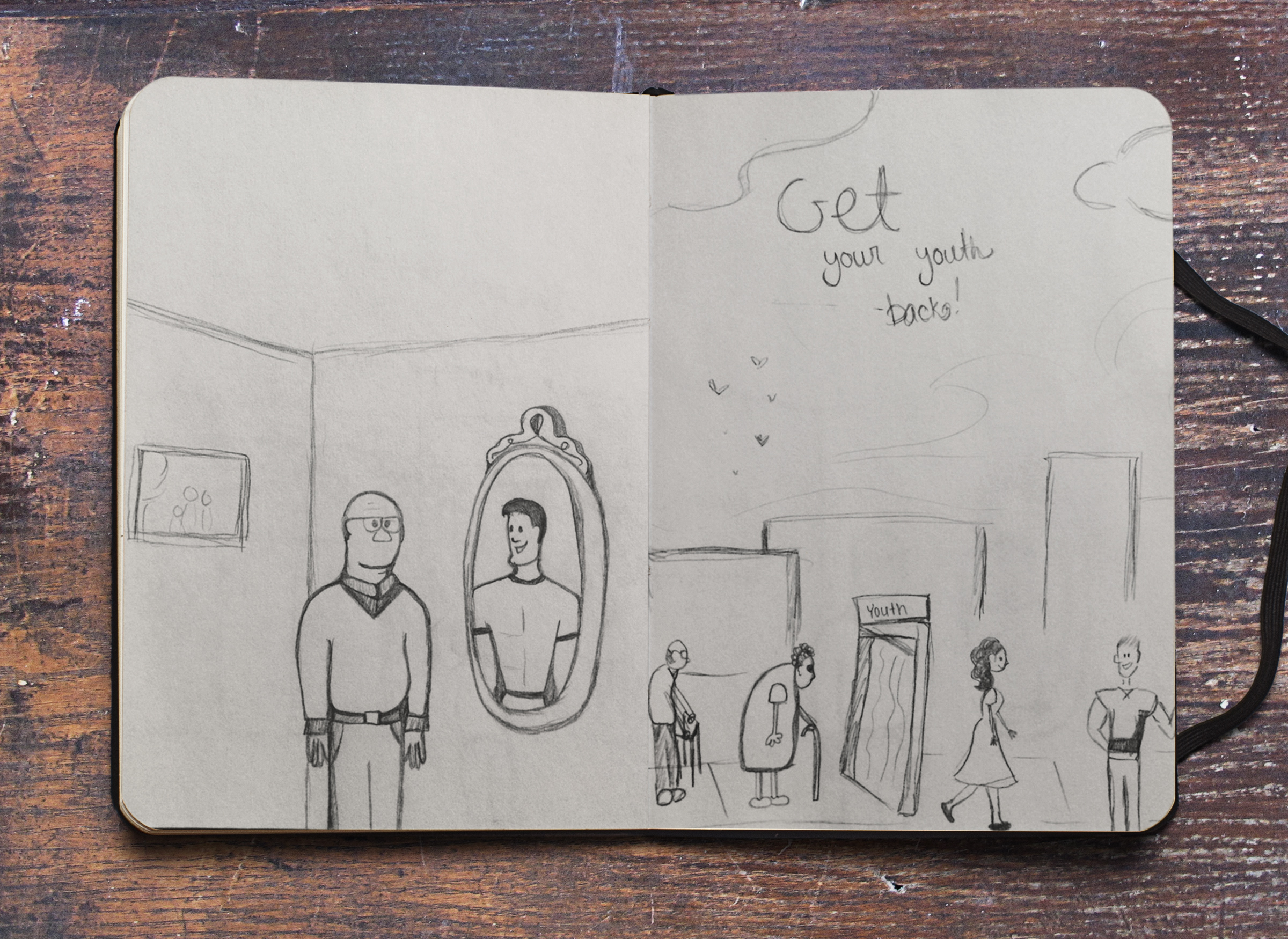
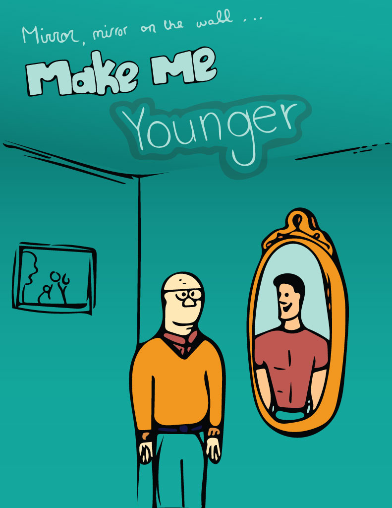
The sketch of the middle-aged guy looking into the mirror and seeing his younger self appealed to me the most. The message seemed easier to understand and not too complicated. The other ideas were good, but I was afraid that people wouldn’t understand the concept of returning to youth.
To turn my sketch into an illustration I used the Adobe Shape app to convert my drawing into a vector graphic. I brought this vector graphic into Adobe Illustrator where I was able to adjust the anchor points on my sketch to have smoother and cleaner lines. The Adobe Shape app does really well with smoothing out your sketch, but I still had to do some work in Illustrator.
I used Adobe Kueler to pick out a color scheme and then I used the paint bucket tool in Illustrator to fill in various shapes. I wanted to keep my design clean, simple and flat. I did add a slight gradient to the walls of the room so that it would have just a hint of depth.
I wanted to add some illustrated text to my design because I felt like it would get the message across even quicker. I know that I tend to just flip through magazines and if I can understand the message instantly, then I will be more likely to read the article. I sketched out the text and I played around with the positioning.
This is what I got….
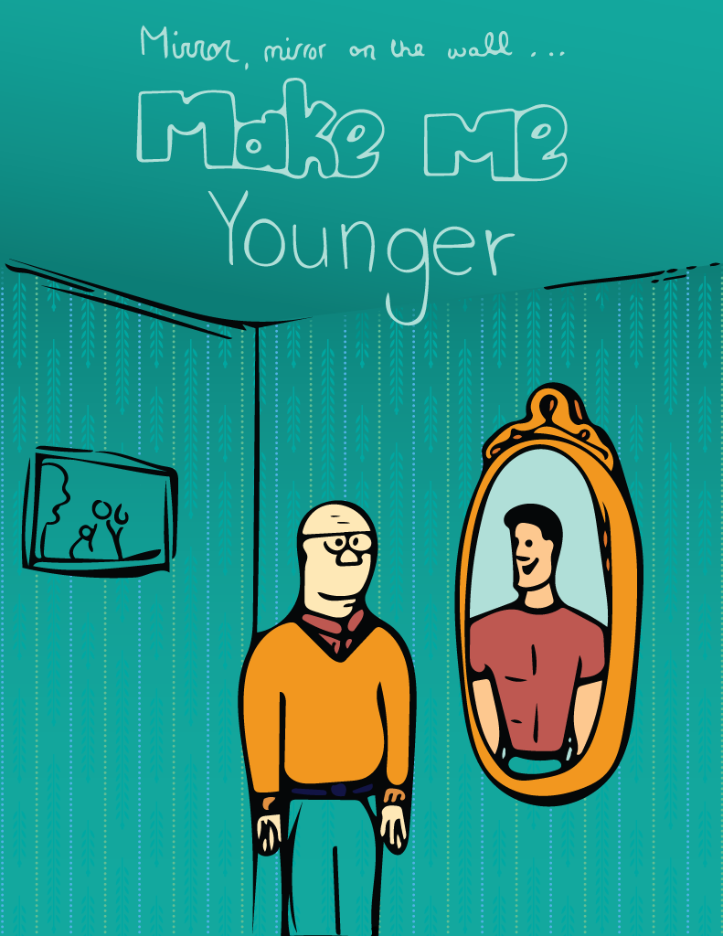
I was really happy with my draft and didn’t know how much I really wanted to change. The text was bothering me and I asked several people for advice and simplified the text and made it run straight on rather than being slanted.
I wanted to add more items to the room, so I tried adding more picture frames, but it was just too cluttered. I realized the picture wasn’t at the same perspective as the rest of the room. I played with the anchor points to make the right end a little narrower.
Lastly, I wanted to add some pizzazz to the wall paper that wouldn’t be distracting. I went through the different patterns in Adobe Illustrator and found a subtle but effective pattern. I used the blending modes and clipping mask to get it just on the walls and to look blended.
Here is what I ended with…
And it this were really in a magazine, it might look something like this…