Illustrated Website Mock-up
COMM 305 Vector Graphics Project
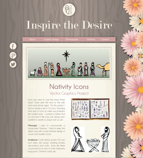
Web design is extremely important in today’s ever-growing online presence. I have been able to take a basic web design course where I learned HTML and CSS. I learned in this class the importance of a website mock-up. There are many talented web developers, but they don’t always have design skills to make the front end look as cool as the back end works. I have illustrated a website layout for a made up site called Inspire the Desire.
Message:
I designed a feminine looking design website. This website is a design website that is meant to inspire others. I wanted my site to have a modern-vintage feel with dusty colors because this is a popular style today.
Audience:
Teenage and adult women. I want to target the trendy ladies that would pin images from the site to Pinterest – the artsy, crafty, DIY, ladies of the worldwide web.
Process:
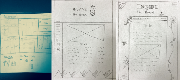
I began this process by researching websites that I like the design of. I found some pretty sweet sites and I began sketching layouts with the elements I liked. I made a few thumbnail sketches and then went on to create some larger more detailed sketches so I could really see how things would lay out.
Sketches:
I feel that my sketches were pretty rough, but they gave me a really good starting point and helped to generate ideas for what I wanted. Of course my final project looks very different from my sketches, but I always find sketching to be such a key element of my workflow and designing.
Drafting: 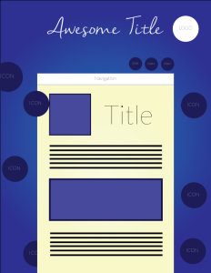
After sketching I created a wire frame in Adobe Illustrator to get a basic idea of what I would be working with. I just threw in some colors I though I would like, but I mainly wanted to see how the spacing would work. Wire frames are shape maps and are great for getting a general idea of what a design might look like.
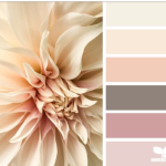
- Color scheme: I went to Design Seeds to find the color scheme that had the feel I was looking for.
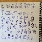
- Logo: I had made some sketches of an owl icon a few weeks ago and I finally had a good reason to finish it into an actual logo.
- Flowers: I began trying to craft some flowers in Illustrator. My first ones were okay, but didn’t reach the look I was wanting. I then went and found a tutorial on how the create 3D flowers using a gradient mesh in Illustrator and I was much happier with the result!
- Social Media: I created three social media icons with the same styling as my logo. Every website has social media icons and I wanted mine to fit perfectly with my website and have the same look despite how they look in real life.
My idea with this design was to try and make my site look like a desktop with a wooden desktop, piece of paper, and scattered flowers.
To create the background for my site I watch a few tutorials on how to illustrate a wood grain. It was actually a lot easier than I expected. My wood grain looks like a vector for sure, but I actually like that look. I didn’t want to have a realistic wood grain on my background.
For the display area of the website I wanted it to look similar to a piece of paper. I used a subtle gradient and a variety of brushes to give it some detail. Then I created a drop shadow that would help the elements to stand off the page.
Final Website
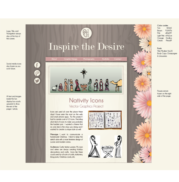
I also made a version with some notes for a web designer that would be included in the Illustrator File I would give to them.




It’s like the first web design project way back in the day except now you have tons more design skills!