Creating My Personal Identity
This is my first project for COMM462 Advanced Visual Media at BYU-Idaho. This class is the capstone course for all Communication majors with an emphasis in Visual Media. For this project, I have created three different logos that represent myself and the work I do.
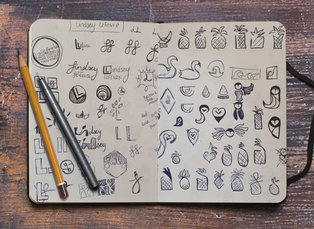
I began by asking family and friends what kind of words they thought represented my personality and character. I got a lot of positive and energetic adjectives in the feedback. It was fun to see what people came up with. Most of the words were ones I already use to describe myself, but there were a few that surprised me. I used these words to brainstorm icons, colors, and styles that would be professional and still portray the essence of Lindsey LeFevre.
Receiving critiques and feedback was so helpful on this project! I had so many ideas and hearing what other people thought really helped to narrow things down. There were a few ideas that I was really fond of, but no one else liked them, so I made sacrifices. Even though this is my personal logo, I want it to have an impact on others and I must value the opinion of others.
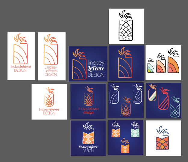
I took my top sketches and brought them into Adobe Illustrator to create these drafts:
For this project, we could only create three logos, so it was decided to ditch my floral design even though I really liked it. I created my Lindsey LeFevre Photography logo about a year ago and I have been using it as a watermark for my photography. I spent a lot of time working on it back then, but for this project I focused on refining my other two iconic logos.
Creating the logos was the easy part. The hardest part was eliminating and narrowing down my options to just one design. I created a variety of logos so that I could have a lot of options and see what possibilities there were. I had to get a lot more critique as well so that I could have help seeing which logos were most effective. I asked a load of people which styles, colors, and typography they liked best. Not everyone agreed, but I was able to get a general feel for what others thought. In the end, I had to be the one to decide and here is what I came up with.
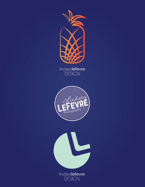
The final product:
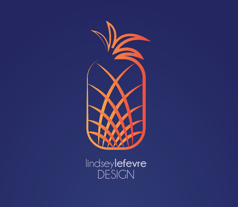
My pineapple logo is definitely my favorite! I decided to use a pineapple for my icon because pineapples are sweet, colorful, and have an energetic shape. I just feel like a pineapple is a good symbol to represent my adventurous and energetic side. I chose the warm color scheme to add energy and warmth. The curved, pointy lines and the gradient create rhythm and movement. My life is never dull and I wanted this logo to be lively and happy!
My photography watermark is my next favorite. This logo was designed to be a watermark that goes on my images and I wanted it to be strictly text based. A lot of female photographers have very cutesy watermarks and I wanted mine to look more professional, but still have a feminine touch. I choose a script font for my first name, but a thick sans serif font for my last name so that LeFevre is always the most prominent and easiest to read. LeFevre is a unique last name and I love it! Having the last name LeFevre is one of the easiest ways I can separate myself from all of the other photographers out there.
My last logo is based off a little logo I made back in my first design class. I like this logo because it is so simple and it incorporates negative space to create my initials LL. I have always been a fun energetic girl, but I also want to be professional and have elegance and grace. I feel like this logo does well to reflect all of those attributes. It is simple and classy, yet the rounded shape adds a little personality. This icon is one that could be used by itself without the text and it would do well to get my message across. This logo would be used for my design work – business cards, resume, website, etc.
Feel free to comment and let me know which logo you like best!



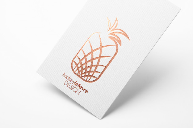
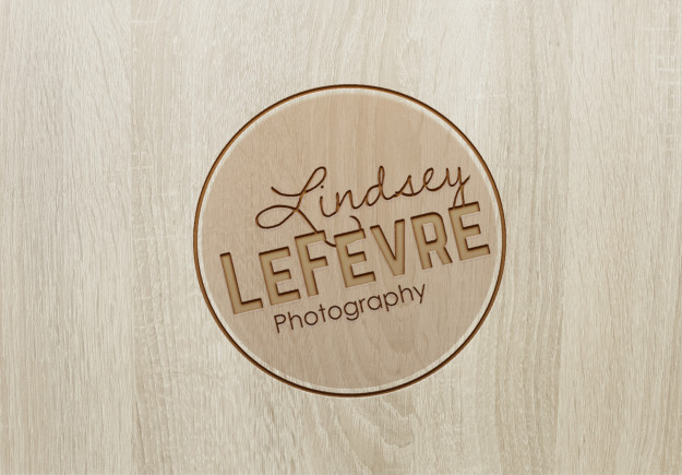

You picked some stellar mockups to display your designs! It really helps to visualize how awesome each logo design would look in a professional atmosphere. I can imagine the metallic one over the head of a secretary’s desk at a hip-looking office.